The Müller-Guttenbrunn Group (MGG) will shortly appear uniformly with a new brand image.
As a result, all the companies in the group present themselves visually and graphically as one large recycling family in which MBA Polymers Austria will become MGG Polymers.
Evolution instead of revolution
The motto of this marketing project was: “Evolution instead of revolution”.
The good and well-known Müller-Guttenbrunn logo will consistently develop one step further, just in the same way as the recycling processes develop – one step after another. The striking recycling circle in the colours blue and green therefore was the starting point for the redesign of the new MGG logo.
A logo for everyone
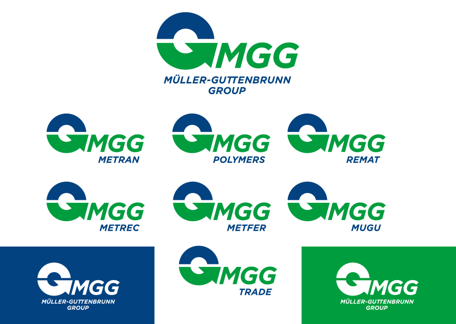
Our common goal was to create a logo that could be used equally for the group as well as for and all individual companies.
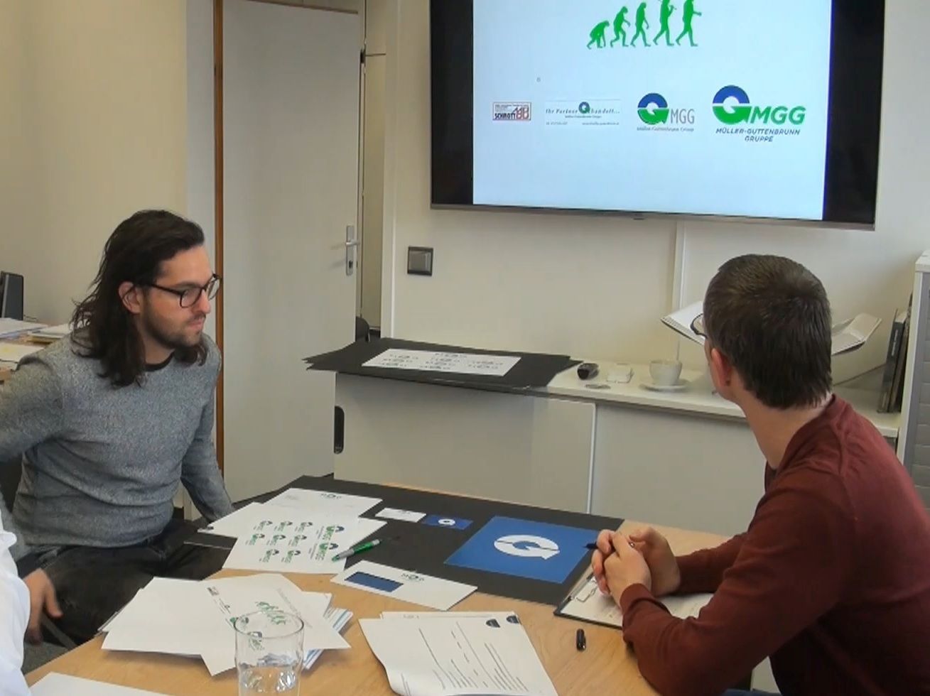
“Our communication agency Sengstschmid, has therefore developed a strong umbrella brand signet under which all companies are optically integrated,“ says Chris Slijkhuis, responsible for Public Affairs, explaining the procedure. The abbreviation of the Müller-Guttenbrunn Group – MGG – thus is the connecting element in all logos together with the recycling circle. With this graphic design of the new logo we have clearly underlined that we are a company active in the Circular Economy.
The used typeface Gotham is from a family of new geometric sans-serif digital typefaces designed in the year 2000 for the Public Space by New York based design house Tobias Frere-Jones. The Gotham typeface was developed to look „masculine, new and fresh to establish a credible voice to it,“ according to Jonathan Hoefler, the designer of the Gotham typeface.
New logos, new names
With the redesigned brand of the Müller-Guttenbrunn Group, the subsidiaries will all present themselves to the outside world as members of the MGG family, some of which even with a new company name.
This is particularly clear in the case of MGG Polymers (formerly MBA Polymers Austria) in Kematen/Ybbs or MGG Trade (formerly Müller-Guttenbrunn Schweiz).
MGG CEO Christian Müller-Guttenbrunn is enthusiastic about the new brand image of the entire Group: „With our new logos, we are expressing that we are constantly developing ourselves further in all areas. In addition, it sends the signal to all of us that we are pulling in the same direction across our group’s operational boundaries.“


